Society of Visual Storytelling

    SVSLearn Forums

    • Register
    • Login
    • Search
    • Recent
    • Tags
    • Popular
    • Users
    • Groups
    • Search

    Would you make any small changes to this postcard design?

    Artwork
    feedback critique
    10
    17
    612
    Loading More Posts
    • Oldest to Newest
    • Newest to Oldest
    • Most Votes
    Reply
    • Reply as topic
    Log in to reply
    This topic has been deleted. Only users with topic management privileges can see it.
    • braden H
      braden H last edited by

      Thanks for the feedback on the front side. I think I'm happy with this design in general but I'm doin' anything super wrong (dude, the USPS won't handle because the image is 1/128th of an inch to far into the address area) I'd love some feedback.

      And or, you know, any general feedback (sorry I know 'general feedback' is super hard to give, lol)

      Thanks! 😃

      dc131ca5-6b4f-445a-a0cd-11b19ab69720-image.png

      NatLundeen Jeremy Ross carriecopadraws 3 Replies Last reply Reply Quote 7
      • Coley
        Coley last edited by

        If I was an agent, I'd seriously snap you up so fast for a book project! It looks awesome to me

        https://www.instagram.com/nicoleledrewmay/

        1 Reply Last reply Reply Quote 3
        • TessaW
          TessaW last edited by

          I don't have experience with creating or sending postcards, but from an aesthetic perspective it looks excellent to me. Great job!

          Website: www.tessawrathall.com

          Instagram: www.instagram.com/tessawrathall_art/

          1 Reply Last reply Reply Quote 1
          • burvantill
            burvantill Moderator last edited by

            Ship it!

            Lisa Burvant
            www.lisaburvant.com
            Instagram & Twitter & SVS: @burvantill

            1 Reply Last reply Reply Quote 2
            • NatLundeen
              NatLundeen @braden H last edited by NatLundeen

              @Braden-Hallett said in Would you make any small changes to this postcard design?:

              I don't have anything helpful to add, just to say it looks awesome!

              Instagram: instagram.com/natlundeen/
              Website: www.natalielundeen.com

              1 Reply Last reply Reply Quote 1
              • romy
                romy last edited by

                Yepp, ship ship and away! Happy sailing, great work, nothing to add, kudos. 👍

                1 Reply Last reply Reply Quote 1
                • Jeremy Ross
                  Jeremy Ross @braden H last edited by

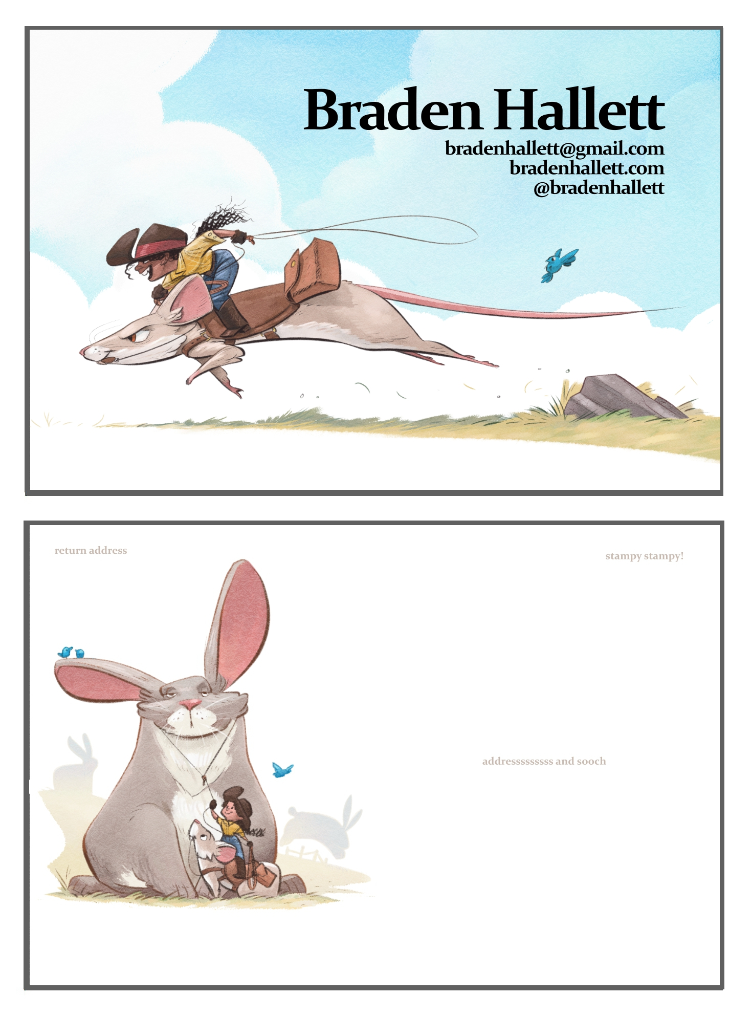
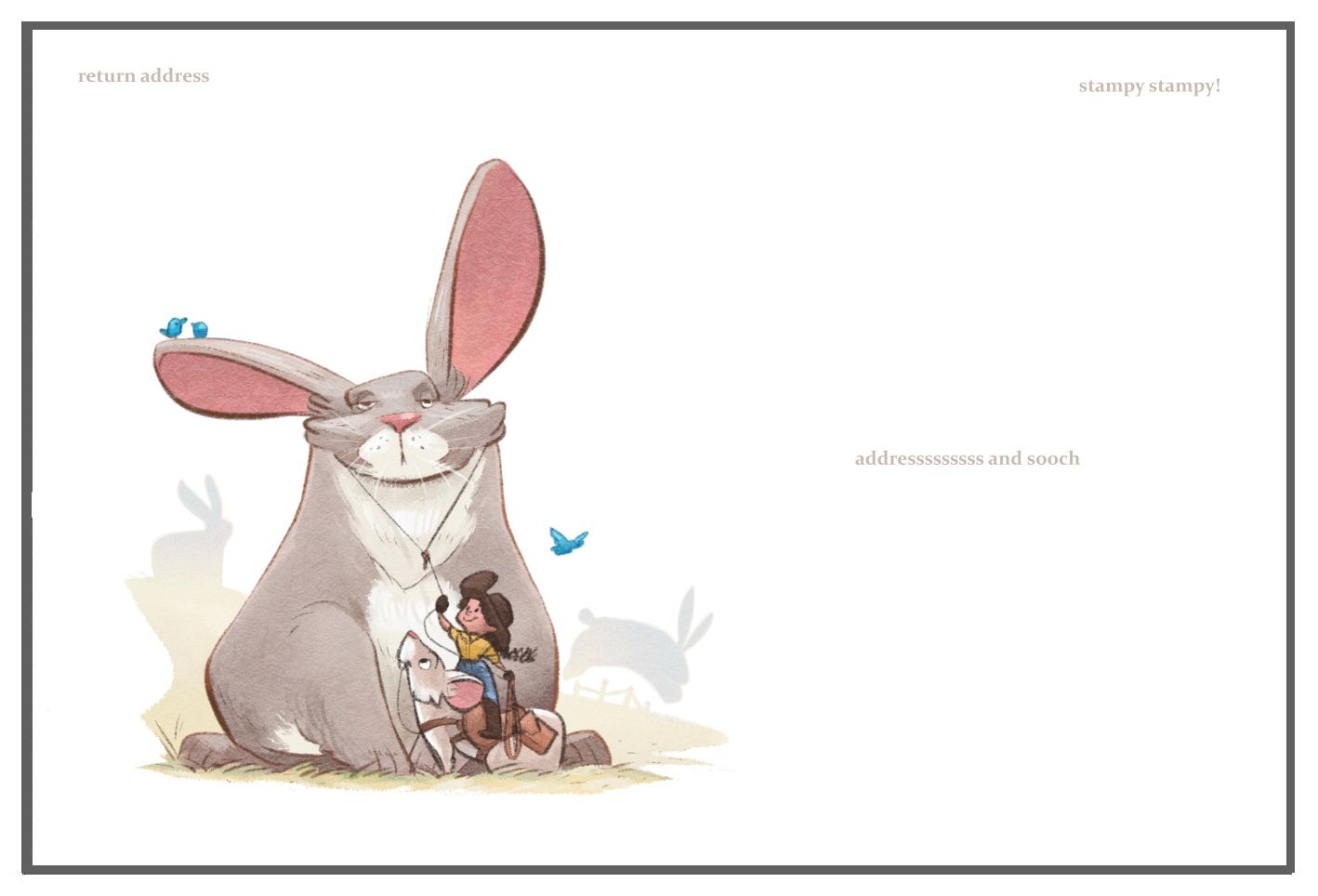
                  Hi @Braden-Hallett, looks amazing. Love how your using the rope to catch an agent!

                  The only thing I can think of is maybe adding a “Thank You” as a watermark?

                  Cheers!

                  https://www.instagram.com/jeremyrayross
                  https://www.jeremyrayross.com/
                  https://twitter.com/jeremyrayross
                  https://jeremyrayross.substack.com/

                  romy 1 Reply Last reply Reply Quote 1
                  • romy
                    romy @Jeremy Ross last edited by romy

                    @Jeremy-Ross Hehe, so does the fat passive bunny represent the agent? ^^

                    1 Reply Last reply Reply Quote 1
                    • T
                      TylerDraws last edited by

                      Gorgeous! Tiny graphic designer thing - maybe 1 more pt of leading between email address, website, social?

                      1 Reply Last reply Reply Quote 1
                      • carriecopadraws
                        carriecopadraws SVS OG @braden H last edited by

                        @Braden-Hallett This is so great! I'd be thrilled to see this in my mail. I would only suggest having the contact info not bold (if only your name is bold it creates a nice contrast), and maybe give it more space between each line, they feel a little cramped.

                        Carrie Copa
                        https://carriecopadraws.com/

                        1 Reply Last reply Reply Quote 1
                        • Norman Morana
                          Norman Morana last edited by

                          Killer! I really dig the fix on the front side. I have one more little nit pick XD This can be subjective, but the spot illustration feels a little cramped. I'm not sure where your safe areas are. I bumped them over to the right a bit and down a smidge. It felt a little more balanced and you can avoid getting the edge of you illustration cut off. Excited to see where these lead you!

                          Postcardback_edit.jpg

                          Onwards,

                          Norman

                          normanmoranaillustration.com
                          instagram.com/norman_morana/

                          braden H 1 Reply Last reply Reply Quote 1
                          • braden H
                            braden H @Norman Morana last edited by

                            @Norman-Morana In this particular case, (though I agree with you)
                            I'm going by a USPS postcard template (address area should be X inches wide, barcode area should be Y inches high) so it's kinda jammed over to the side for the postal system 🙂

                            Norman Morana 1 Reply Last reply Reply Quote 0
                            • braden H
                              braden H last edited by

                              Thanks everyone! I'll make a couple of changes to the font and then get it printed 🙂

                              1 Reply Last reply Reply Quote 0
                              • braden H
                                braden H last edited by

                                @Jeremy-Ross @romy I hadn't thought of it as catching a fat rabbit agent, but now I do, lol

                                1 Reply Last reply Reply Quote 0
                                • Norman Morana
                                  Norman Morana @braden H last edited by

                                  @Braden-Hallett Oh that makes so much sense! It had seemed uncharacteristic haha. If you find it bugs you, maybe play with the scale a little. My day job is as a production artist, I can't help but see these little details 😅

                                  I didn't pick up on this on my first read, but I love that the front is them chasing the rabbit and on the back we get the payoff. Very clever.

                                  Onwards,

                                  Norman

                                  normanmoranaillustration.com
                                  instagram.com/norman_morana/

                                  braden H 1 Reply Last reply Reply Quote 2
                                  • braden H
                                    braden H @Norman Morana last edited by

                                    @Norman-Morana said in Would you make any small changes to this postcard design?:

                                    I didn't pick up on this on my first read, but I love that the front is them chasing the rabbit and on the back we get the payoff. Very clever.

                                    Thanks! Story telling is the whole idea, right?

                                    Norman Morana 1 Reply Last reply Reply Quote 2
                                    • Norman Morana
                                      Norman Morana @braden H last edited by

                                      @Braden-Hallett exactly!

                                      Onwards,

                                      Norman

                                      normanmoranaillustration.com
                                      instagram.com/norman_morana/

                                      1 Reply Last reply Reply Quote 1
                                      • First post
                                        Last post